01
project
overview
A brand for a kind of platform the internet doesn't have a name for yet.
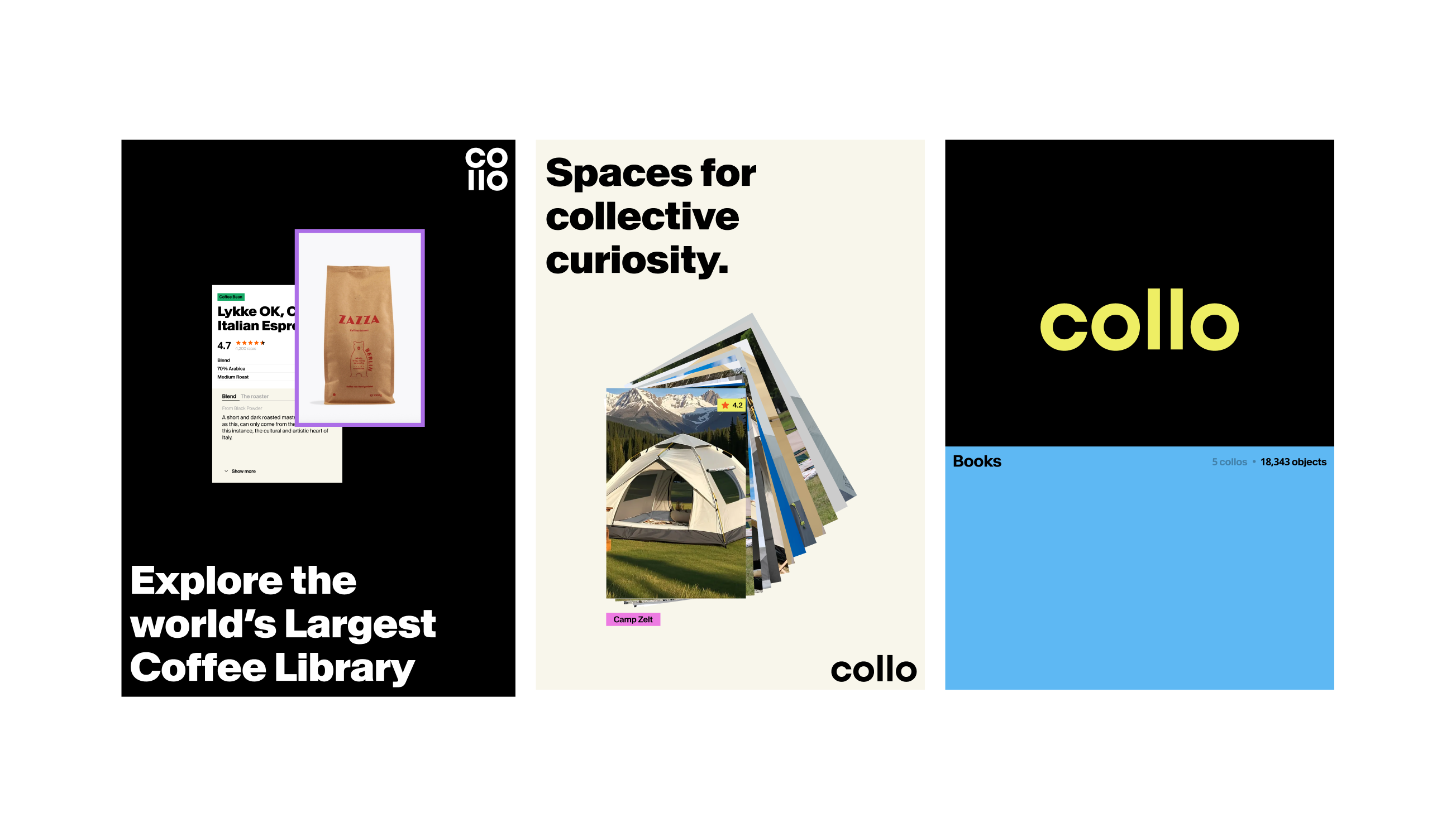
Anat and Uri came to us with a big idea and a category that didn't exist. Collo is an app for building object-centric collaborative platforms — think Vivino for wine, Goodreads for books, but for anything people are passionate about, all living in one place she calls the Colloverse.
The problem was that no one had built the general-purpose version before. Every platform like it — for wine, for birds, for books — exists alone, in its own silo. Anat's vision was to give all of them one home, and to let anyone create a new one.
She needed a brand that could make that abstract, first-of-its-kind idea feel simple, alive, and worth joining. And she needed the core app screens designed, not just the logo. We built it in a two-week sprint.
02
THE MOMENT
The hardest brands to build are for things that don't exist yet. Collo isn't a community platform like Reddit and it isn't a social network like Facebook — it's a new species: platforms built around objects, where the users themselves add the knowledge. Anat even had to coin a term for it, because the language didn't exist.
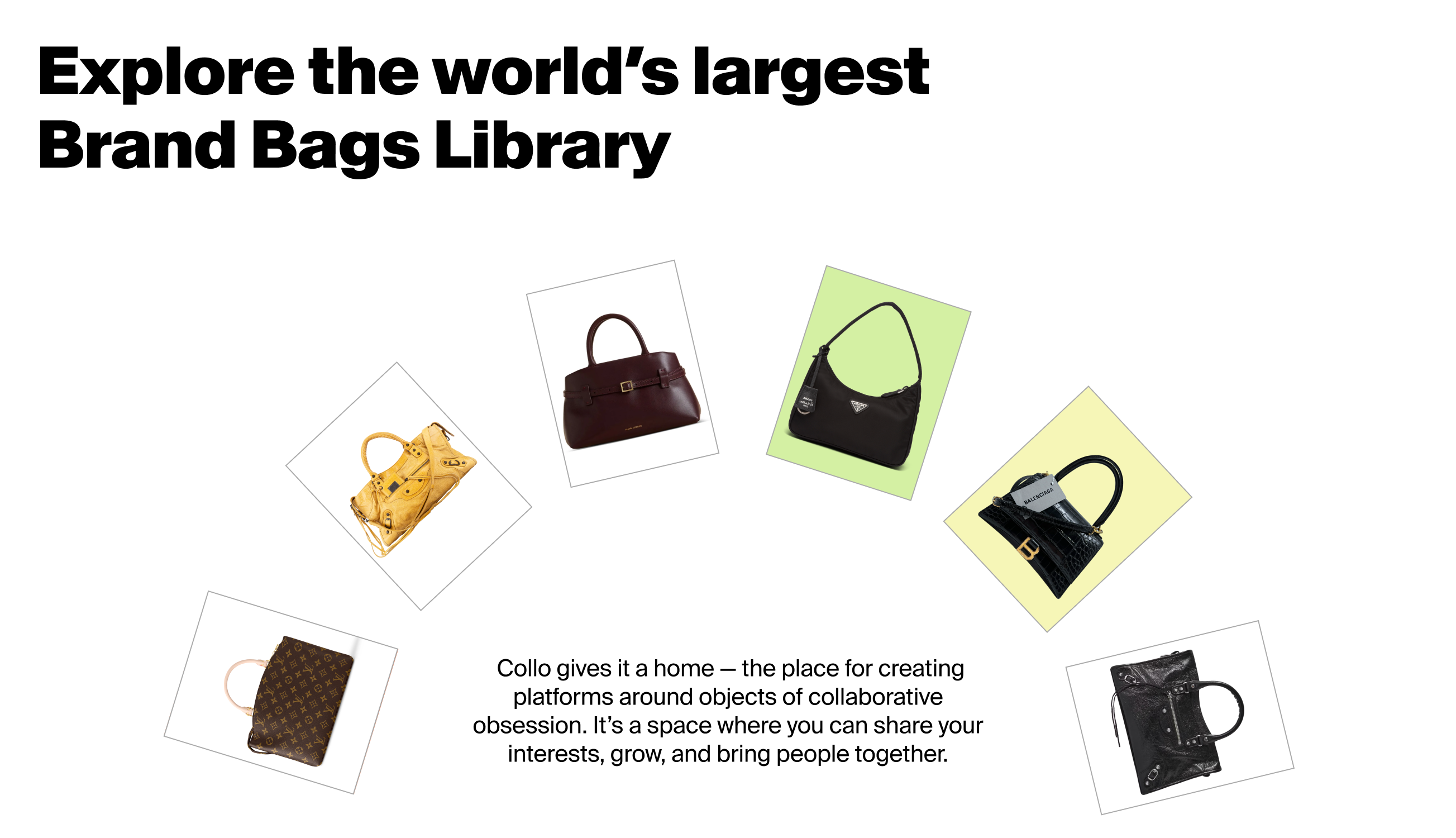
That was the challenge the brand had to solve. It had to make an unfamiliar concept instantly graspable, so a first-time visitor understands Collo in seconds. It had to feel playful and alive, matching the passion people bring to the things they love, while still reading as credible and clean enough to be a real product. And it had to treat every object — a wine, a coffee capsule, a children's book — with the reverence of something precious. As Anat put it: an object of obsession, handled like jewelry.
03
WHAT WE DID
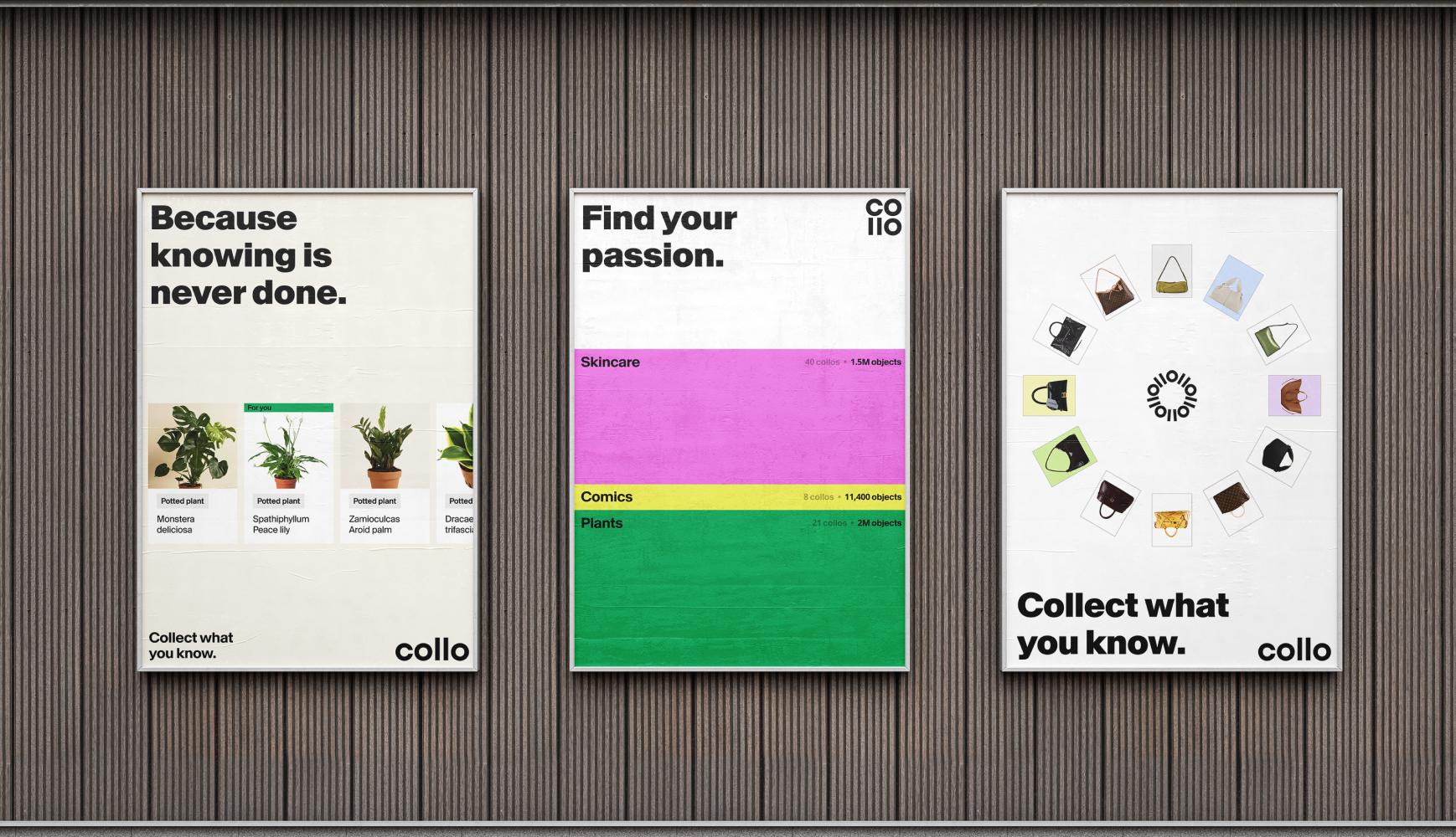
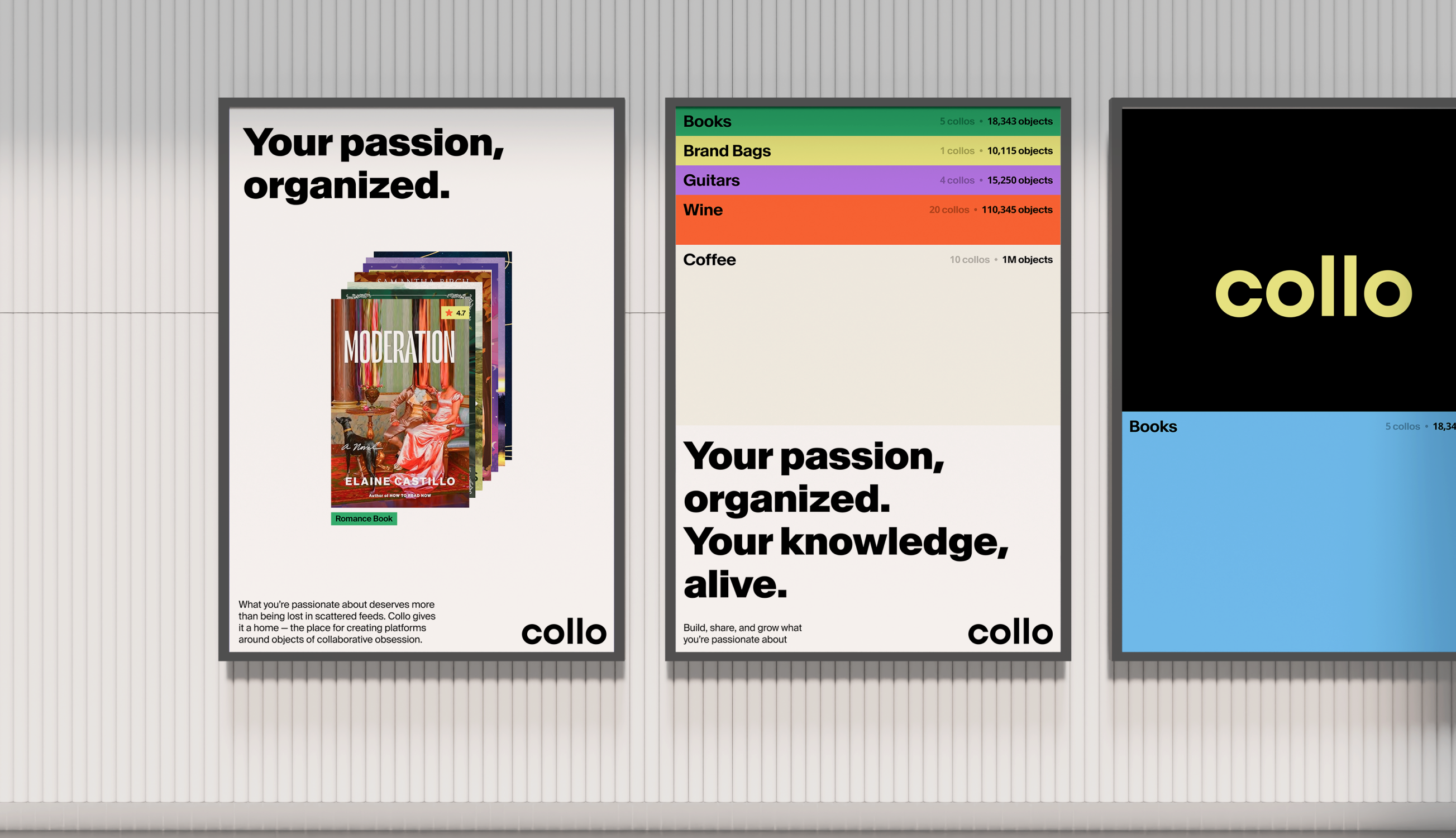
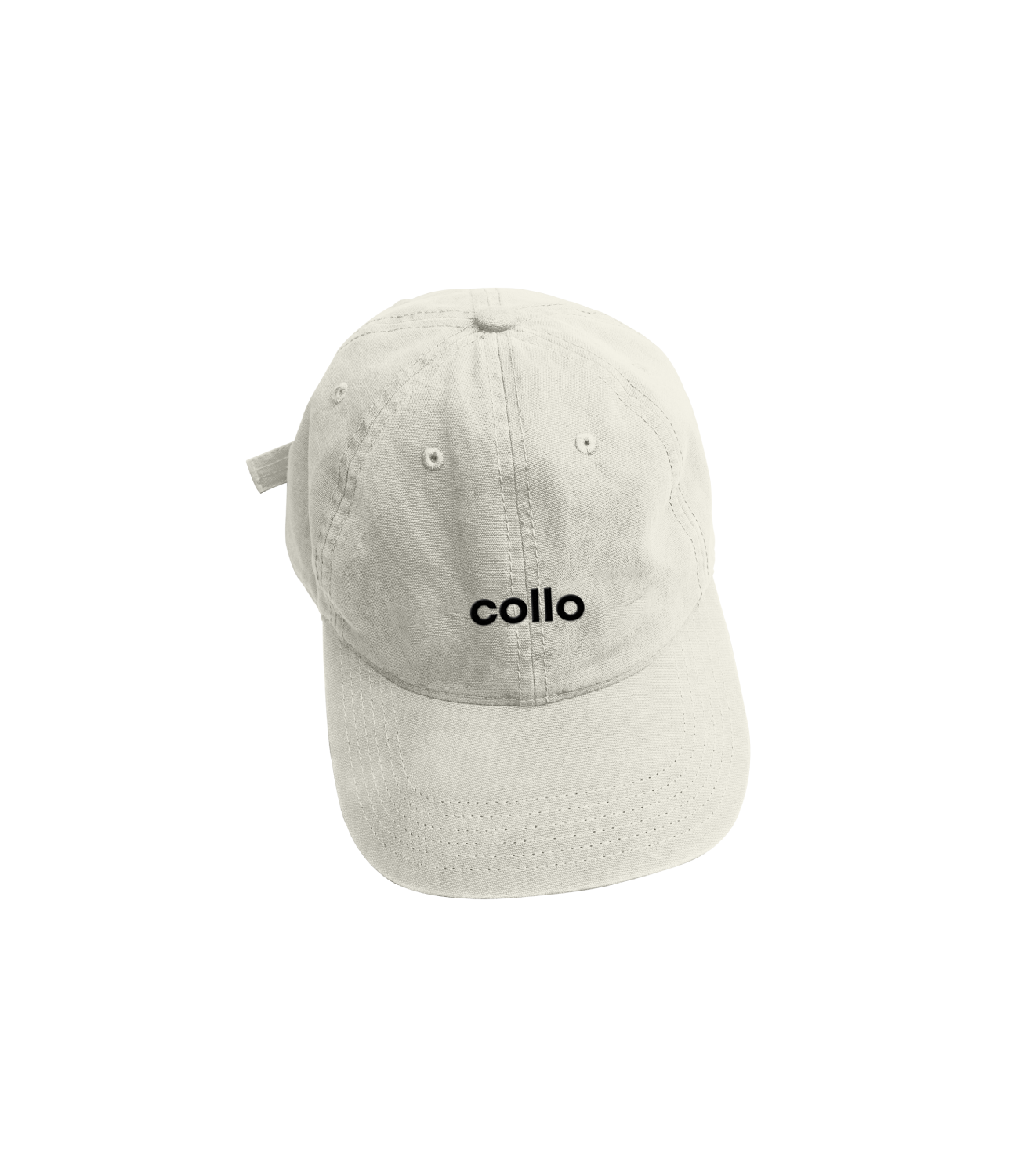
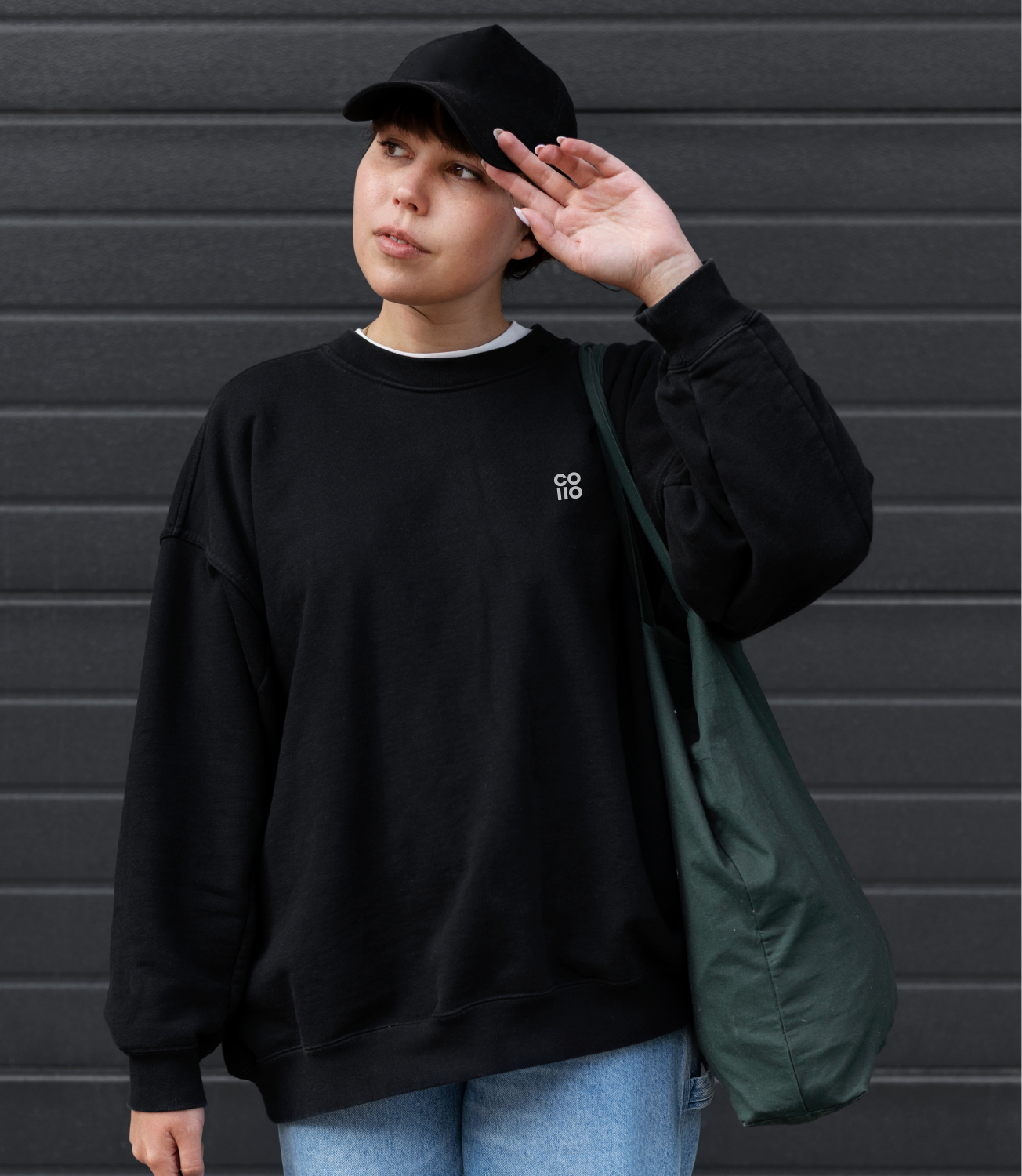
We built a brand around one warm idea: what you're passionate about deserves more than being lost in a scattered feed. Collo gives it a home.
→ We named the obsession. The strategic heart became a line the whole team fell for: a place for objects of collaborative obsession. "Obsession" does the work — it captures the depth of feeling people bring to the things they love, and it sets Collo apart from the flat language of "community" and "content."
→ We made the unfamiliar feel friendly. For a concept this new, clarity was everything. We paired bulky, characterful headlines with clean, simple body type — playfulness you feel, legibility you rely on — so the brand has personality without ever becoming hard to understand.
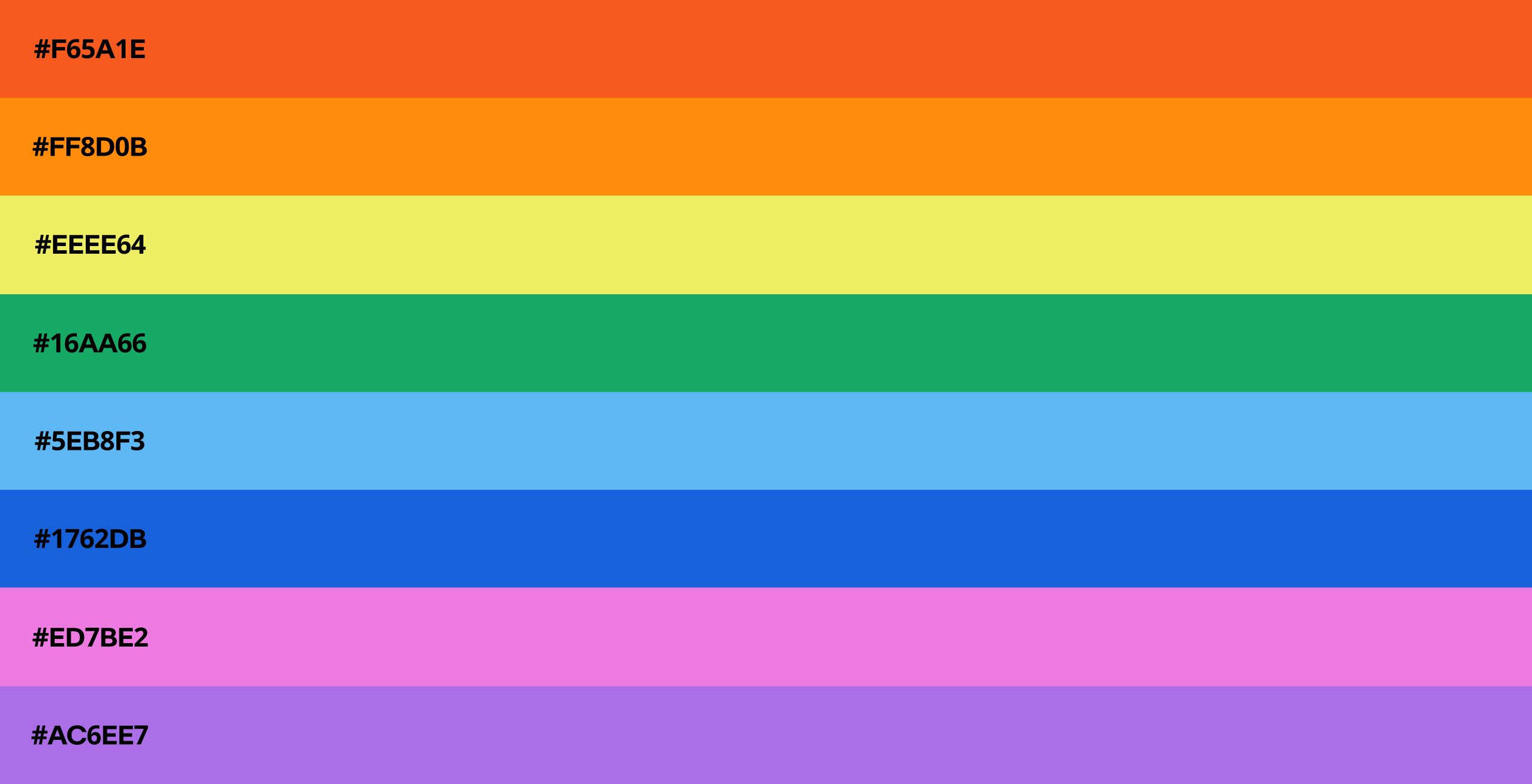
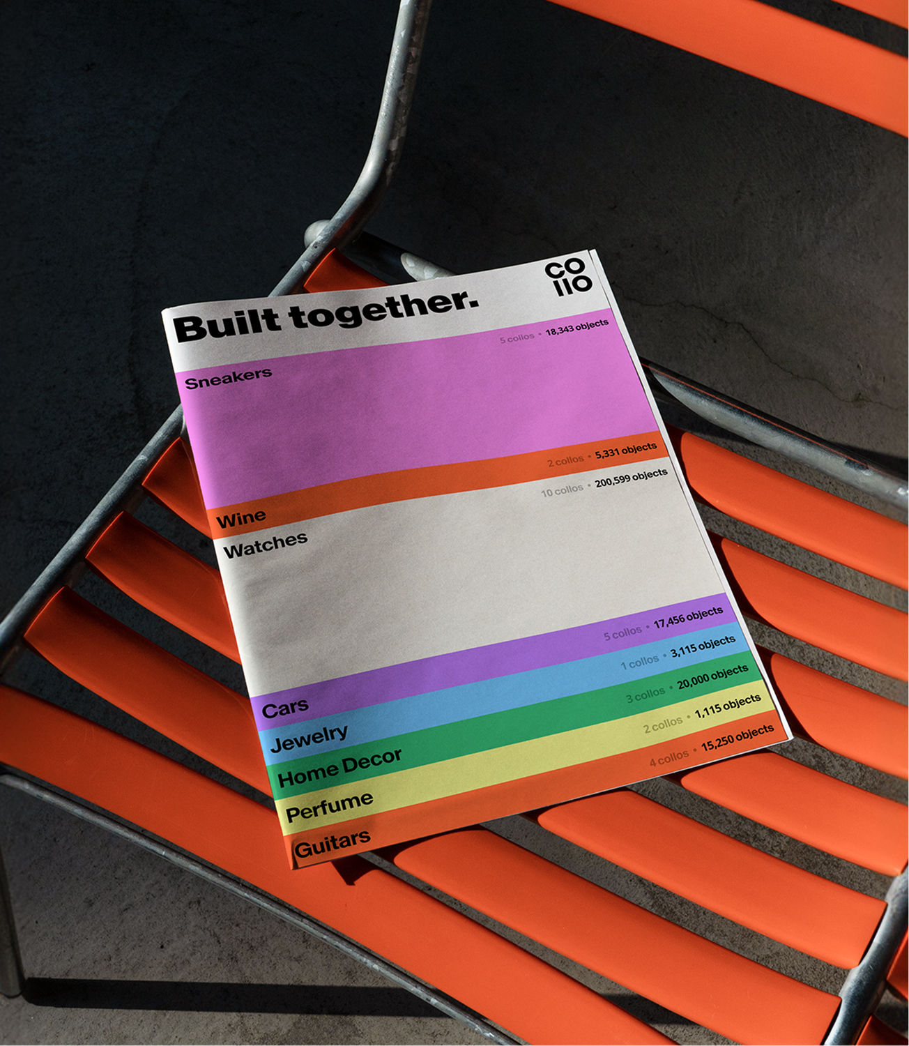
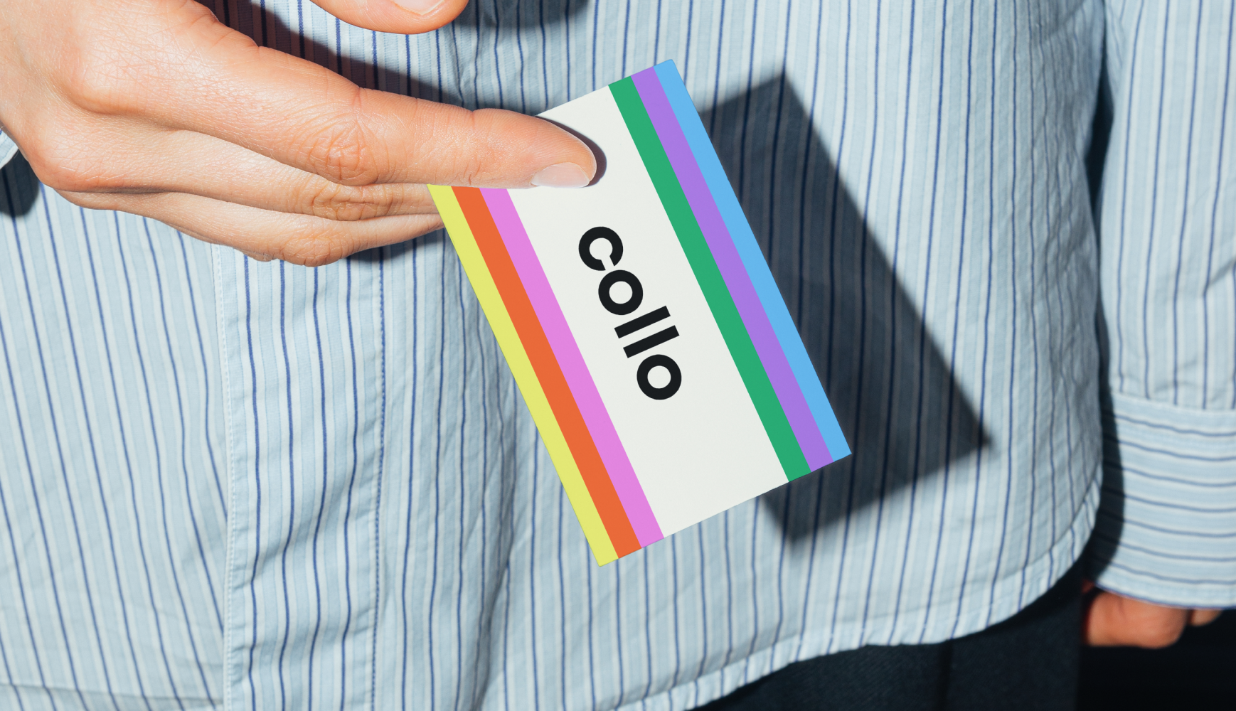
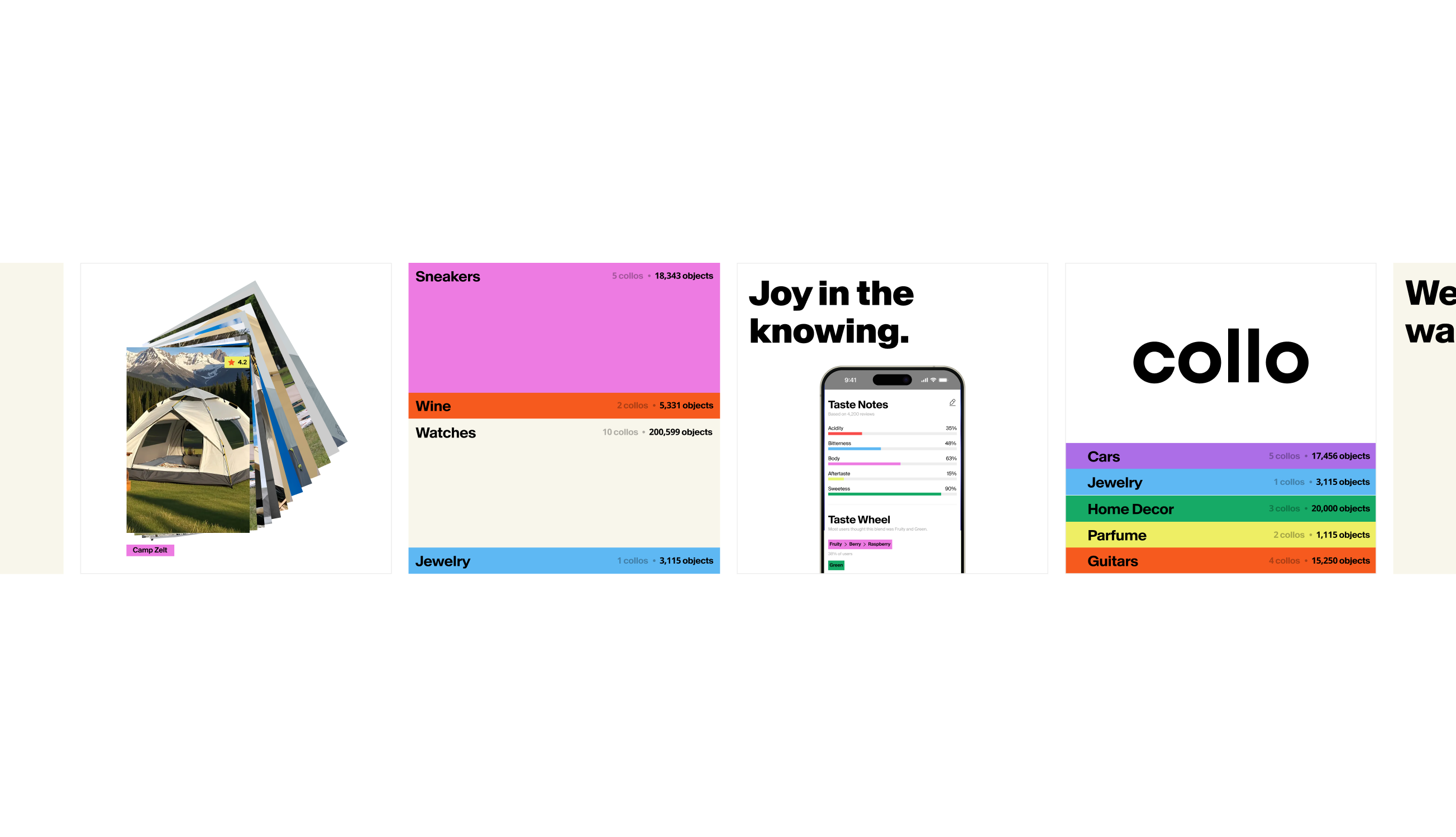
→ We built a color system as alive as the platform. A vibrant multi-color palette, with a pastel counterpart, designed to flex across endless object categories. Color-tag elements let every Collo feel distinct while still belonging to one recognizable whole — the visual logic of a universe of platforms under one roof.
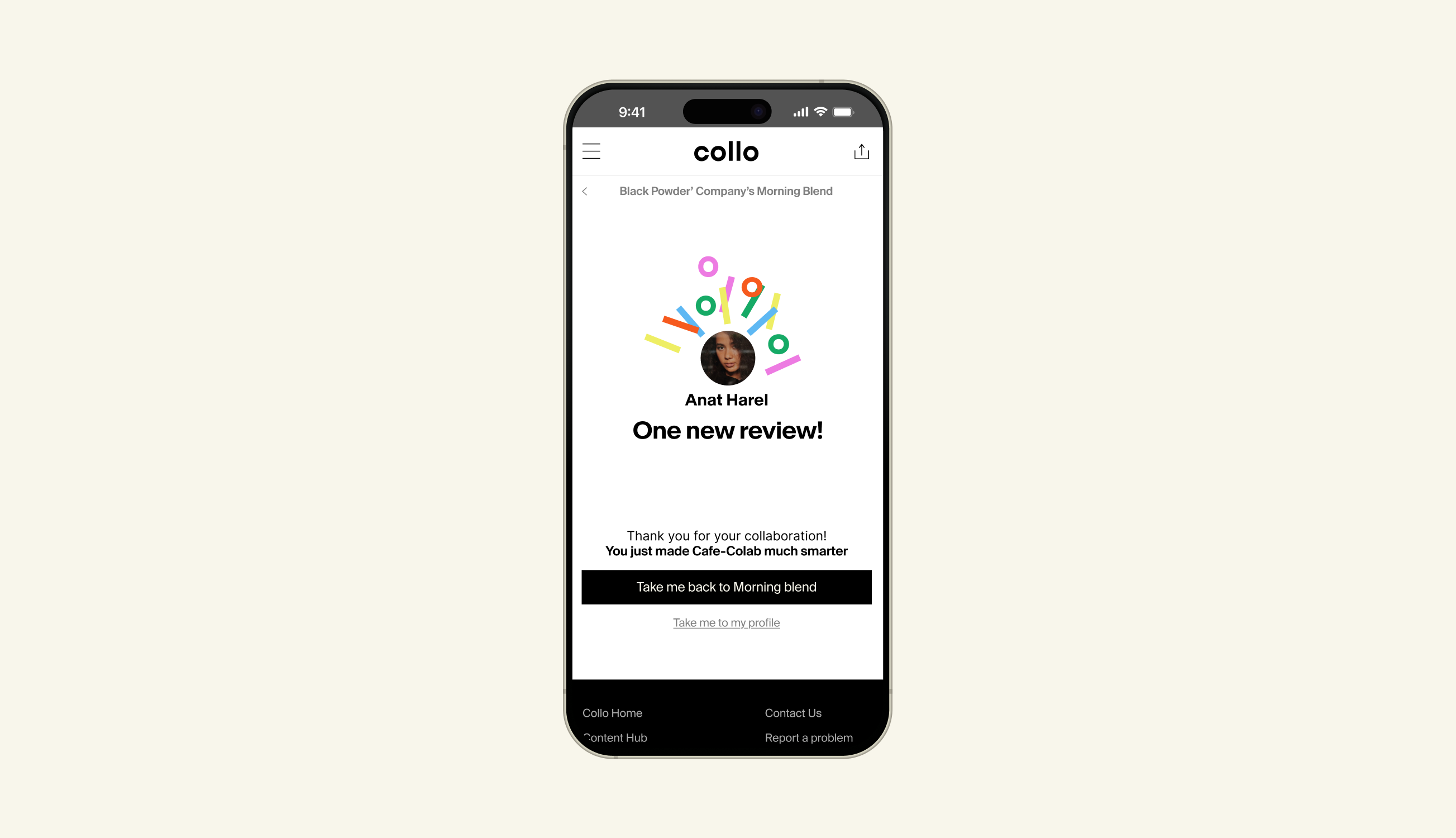
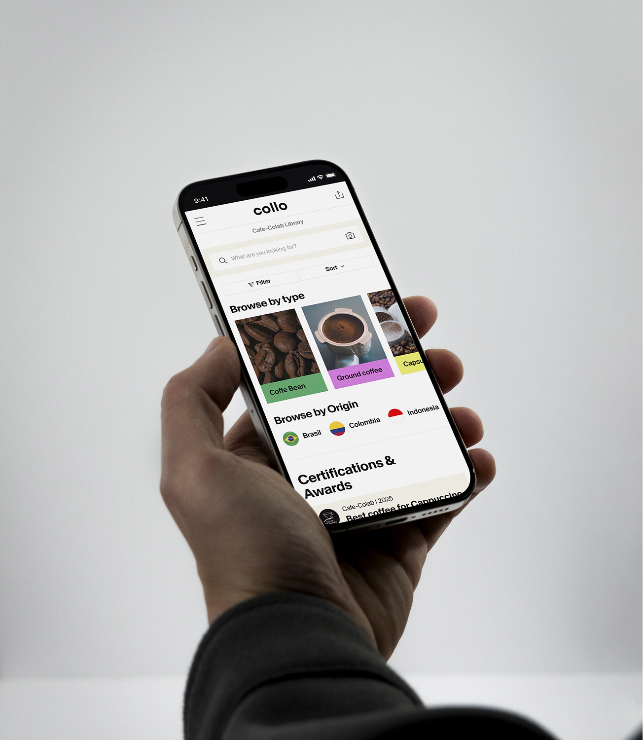
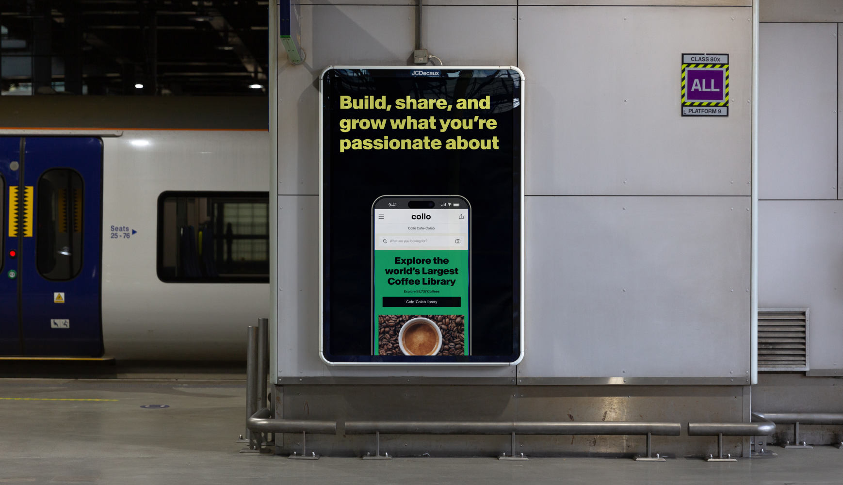
→ We designed the product, not just the brand. Beyond identity, we designed the five core screens — homepage, object page, rating and review, profile, and library — handed over connected and build-ready, so Anat could hand her developers something that already felt alive.
04
THE RESULT
Collo walked out of the sprint with a brand and a working product vision for something that had only existed in Anat's head — a first-of-its-kind platform made to feel simple, vibrant, and ready to join. The abstract idea had a name, a voice, a color world, and screens you could almost tap.
A complete identity plus five core app screens, delivered in a two-week sprint. Not a mockup — a foundation, built connected and ready to hand to developers, that turned a category-defining idea into something real enough to build.