01
project
overview
A brand built to make a gym feel like it belongs to the whole family.
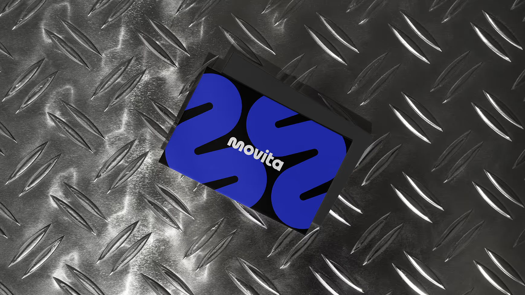
Movita came to us with a name they loved and a category that didn't quite exist yet. On paper it was a gym. In practice it was something wider: fitness, a pool, art and music rooms, classes for kids and adults, all under one roof, built for a community that most gym brands quietly leave out.
The offering was ambitious and a little hard to name. The identity had to hold all of it without collapsing into "just a gym" or drifting into "community center."
They didn't need a logo. They needed a brand that could make a full-family wellness space feel high-end, welcoming, and unmistakably for them.

01
THE BRIEF
Movita is a new kind of space: a complete wellness offering combining a full gym, a pool, fitness classes, and creative programming like art and music, designed for families in a community underserved by mainstream fitness brands.
The team had a name they were excited about and early imagery that wasn't landing. They came to the Sprint to lock the logo, build the identity, and create a system consistent enough to run across signage, stationery, social, and the structure of a website.
02
THE MOMENT
Most gym brands are built for one person: an adult, alone, on a machine. Movita was built for the opposite — families, kids, a whole community moving through one space across a day.
That created a positioning tightrope. The brand had to feel high-end and professional without tipping into exclusive, luxury, or clinical. It had to read as premium and aspirational while serving a community that values warmth and belonging over gloss. And it had to carry a fuller, more human offering than a gym, without becoming loose or generic in the process.
High-class without being high-brow — that was the line the team kept returning to.
03
WHAT WE DID
We built an identity for a category that didn't have a template, and made deliberate choices to keep it warm, premium, and family-first.
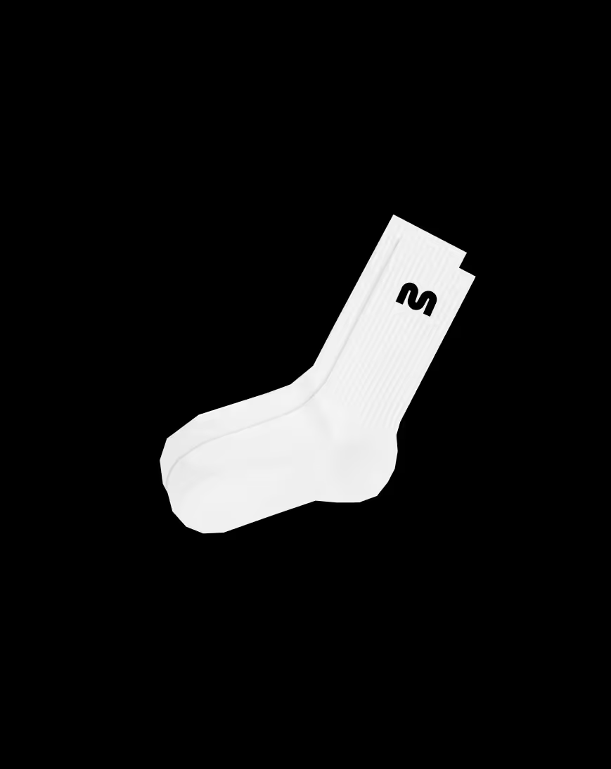
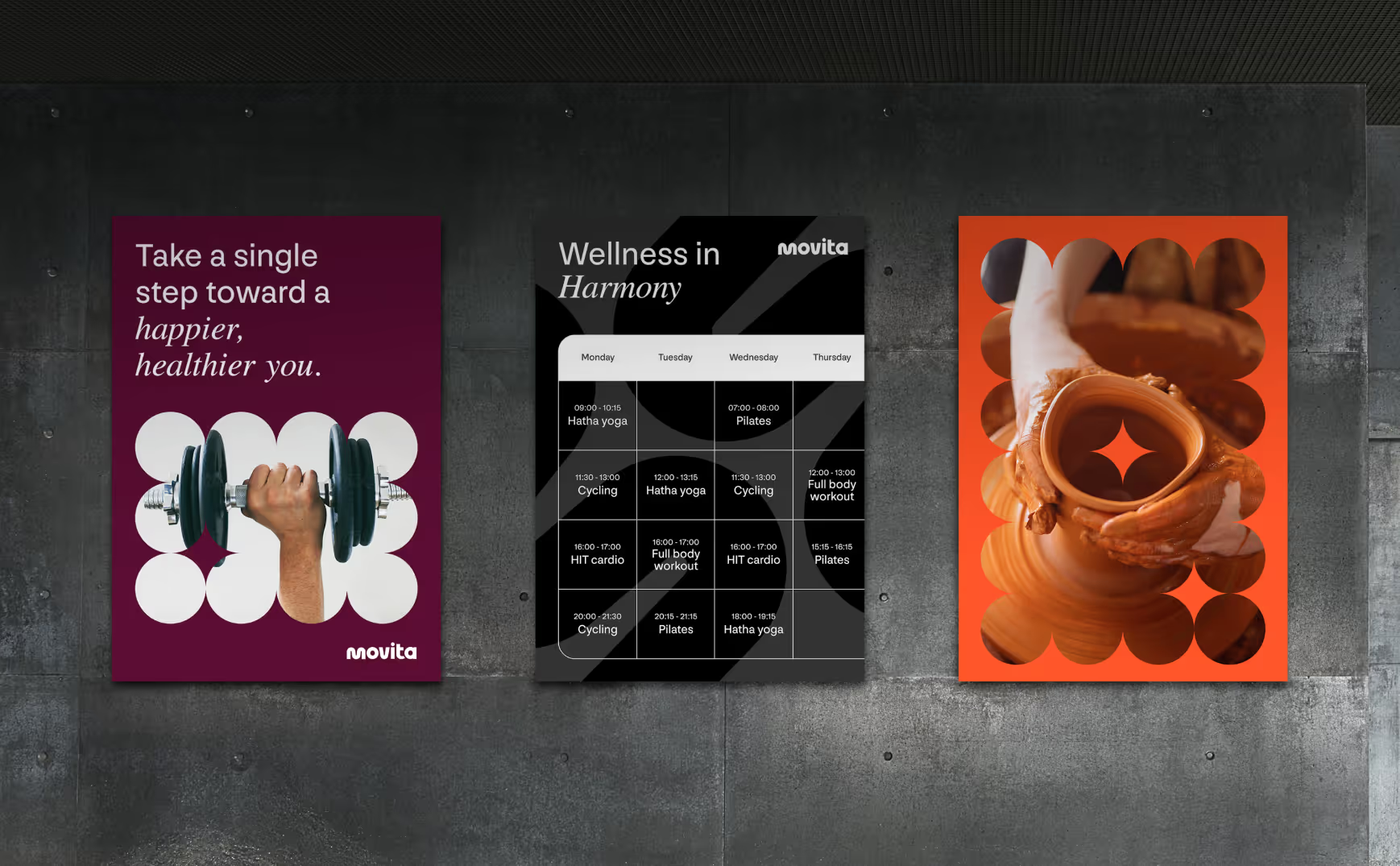
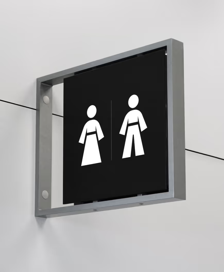
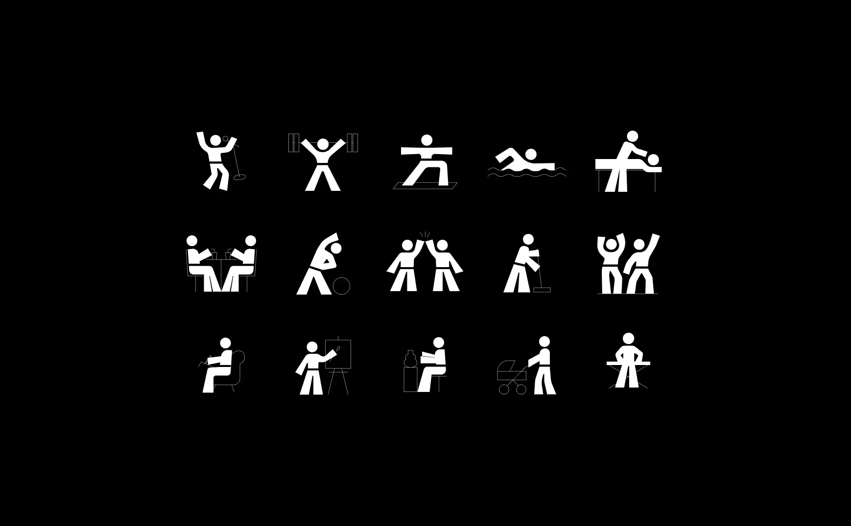
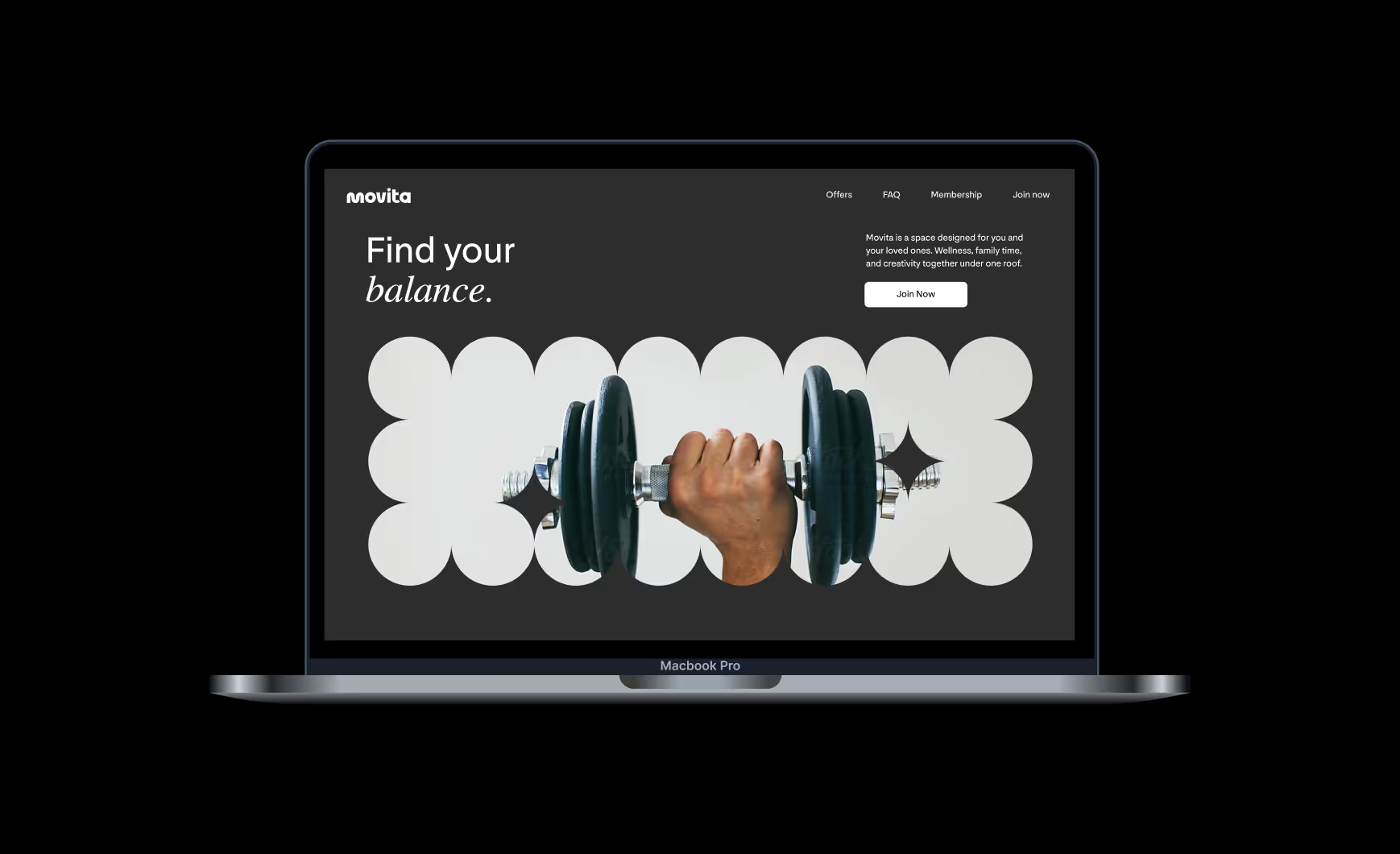
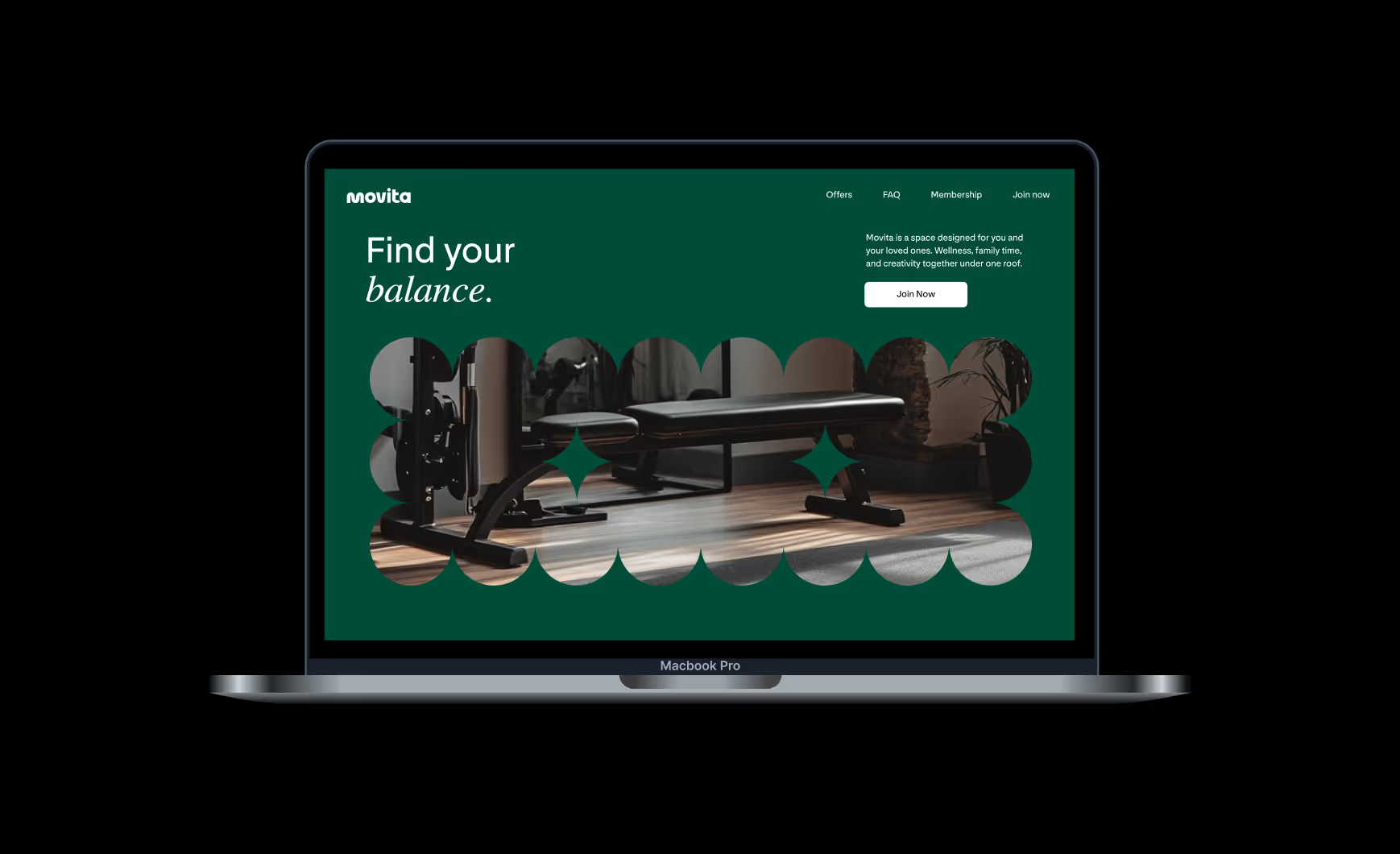
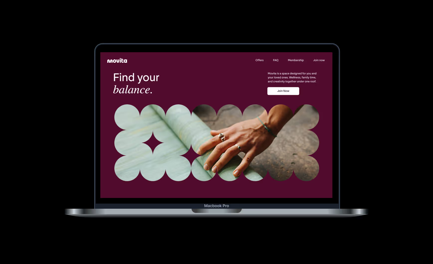
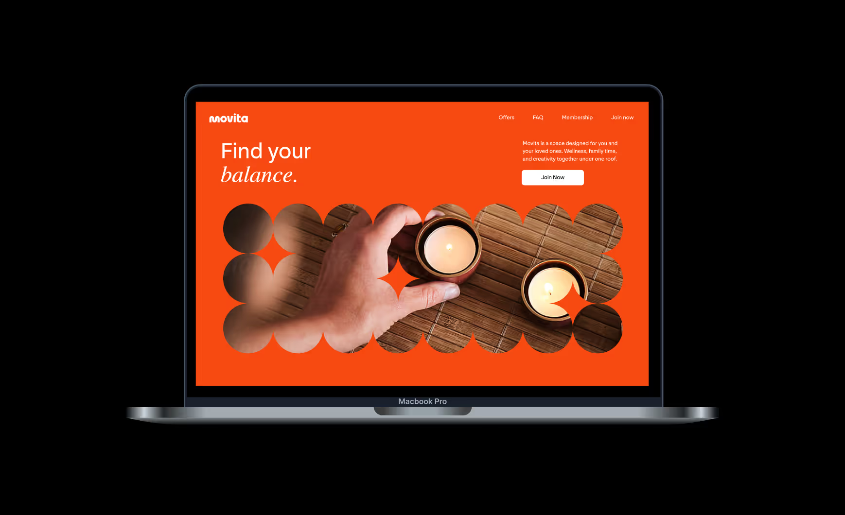
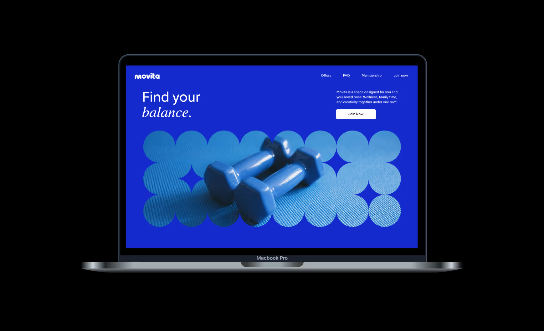
→ We refused the gym cliché. No muscle-man imagery, no hardcore-fitness edge. Movita leans into movement, life, and energy — the qualities already living inside the name — rather than the utilitarian look of the boxes-full-of-equipment competitors.
→ We designed for families, not just members. Most gym brands hone in on the solo adult. We built a system with room for kids, parents, and a full day of activities, so the identity signals a place you belong to, not just a place you train.
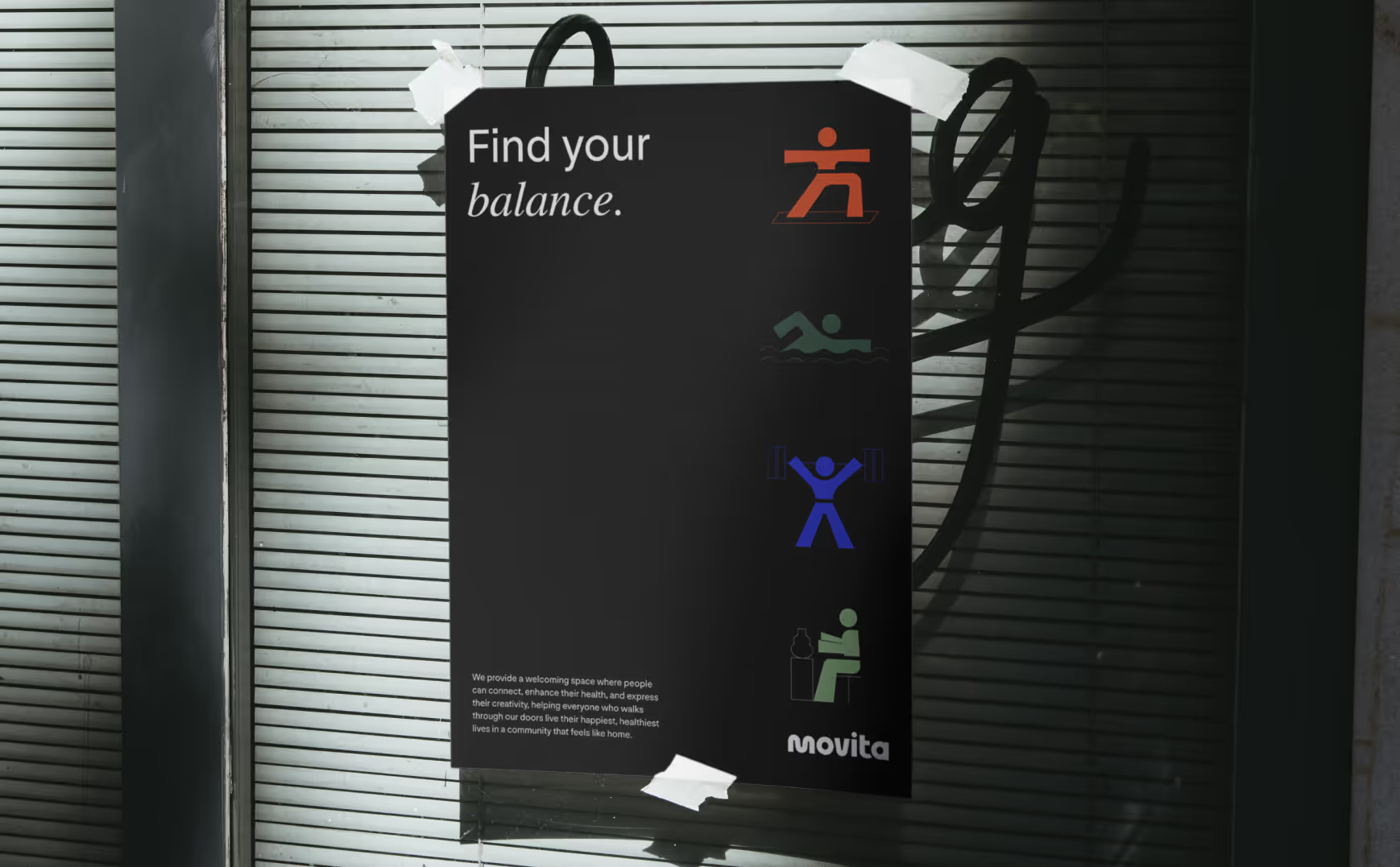
→ We positioned it high-end without going luxury. The system reads as professional and premium — high touch, high service — while staying approachable. High-class without being high-brow, so it feels aspirational to the community without feeling exclusive.
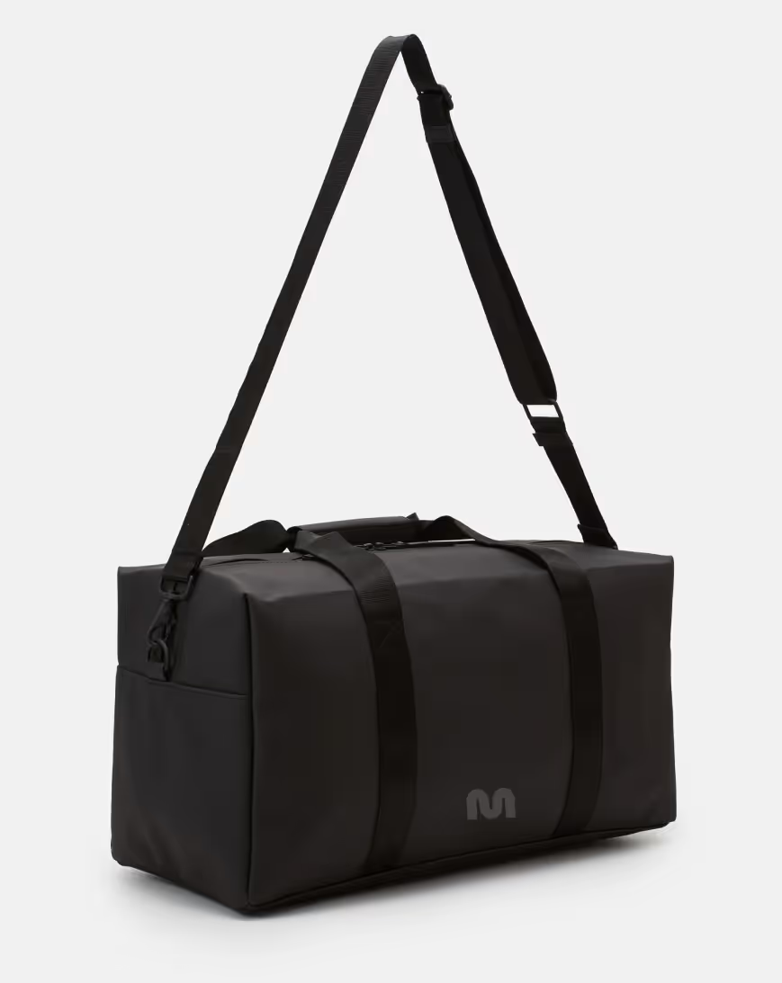
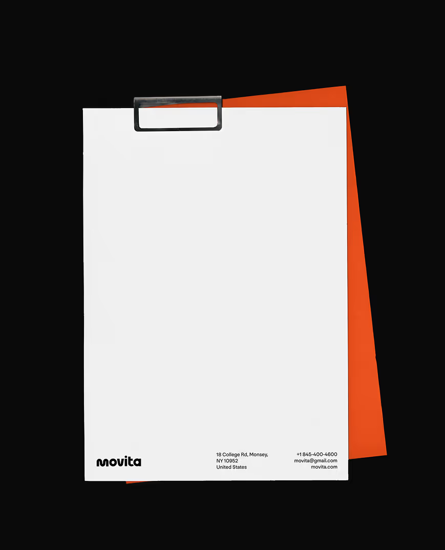
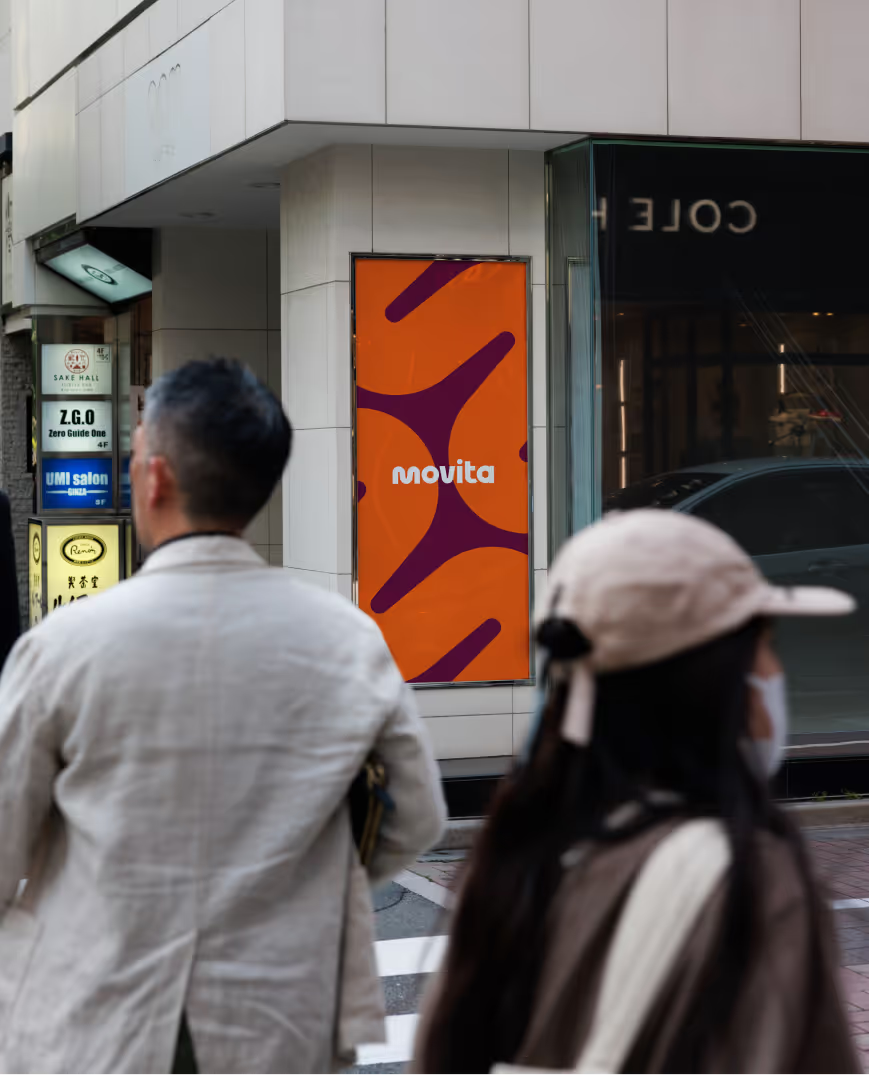
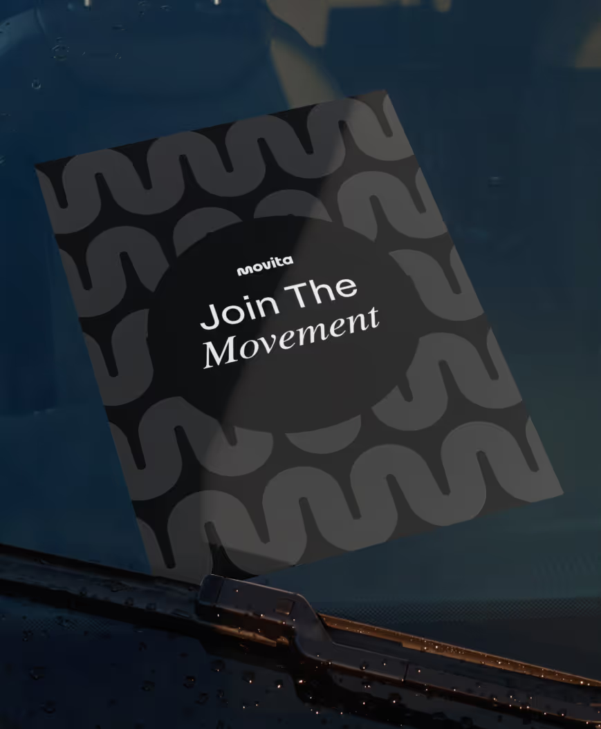
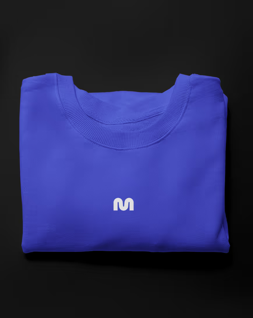
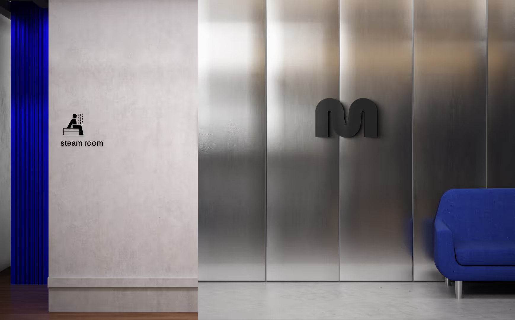
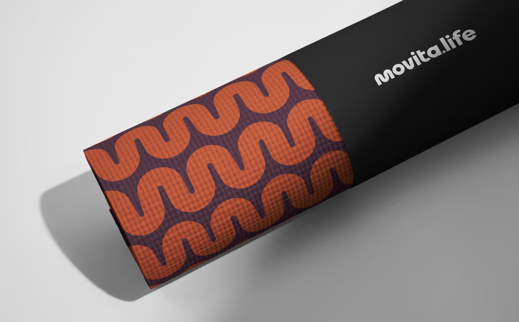
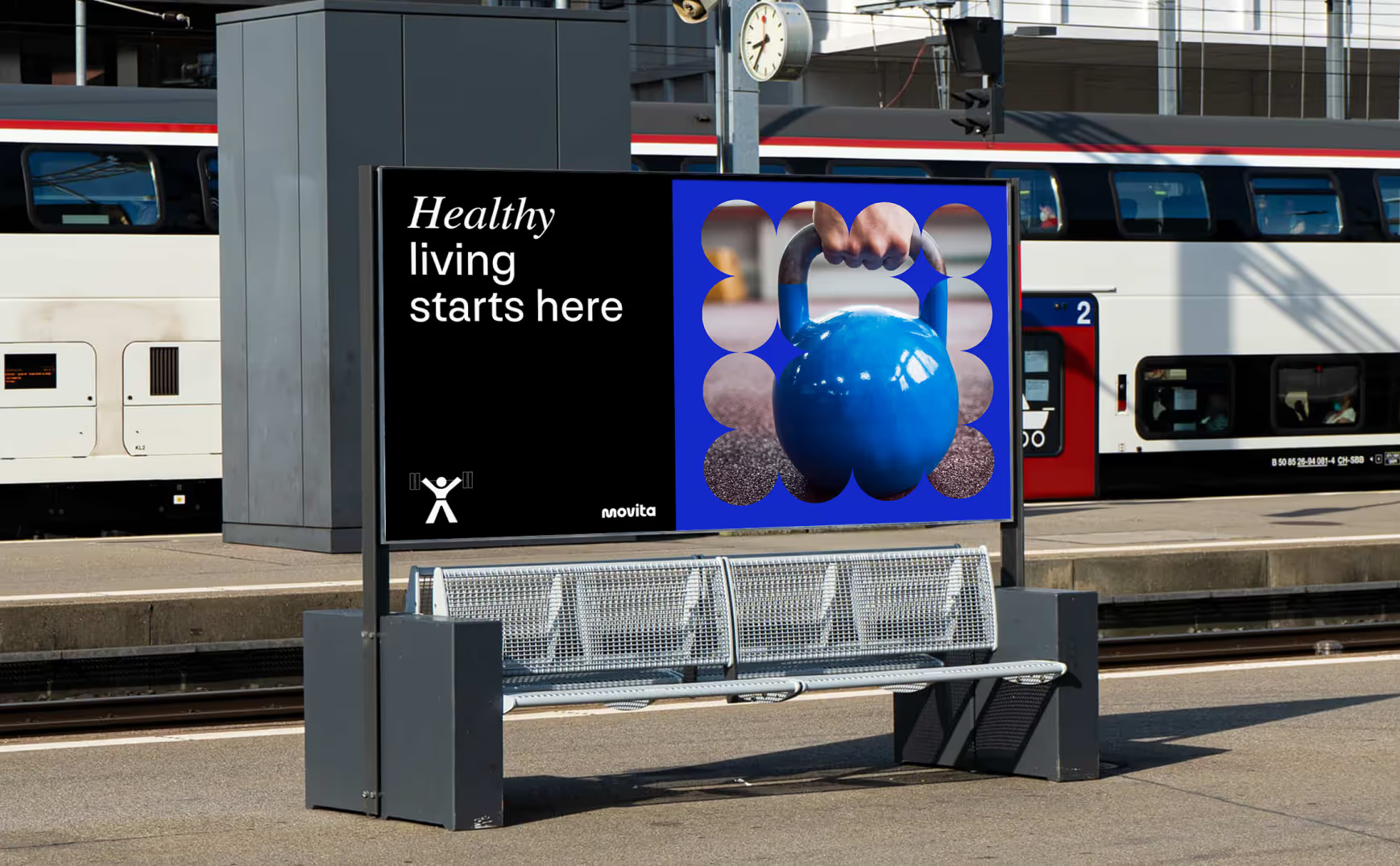
→ We built one system for a many-part offering. Gym, pool, art, music, classes, signage, schedules, price lists. We created a flexible visual framework with a common thread so every touchpoint feels like one place, even as the offering grows into new communities.
04
THE RESULT
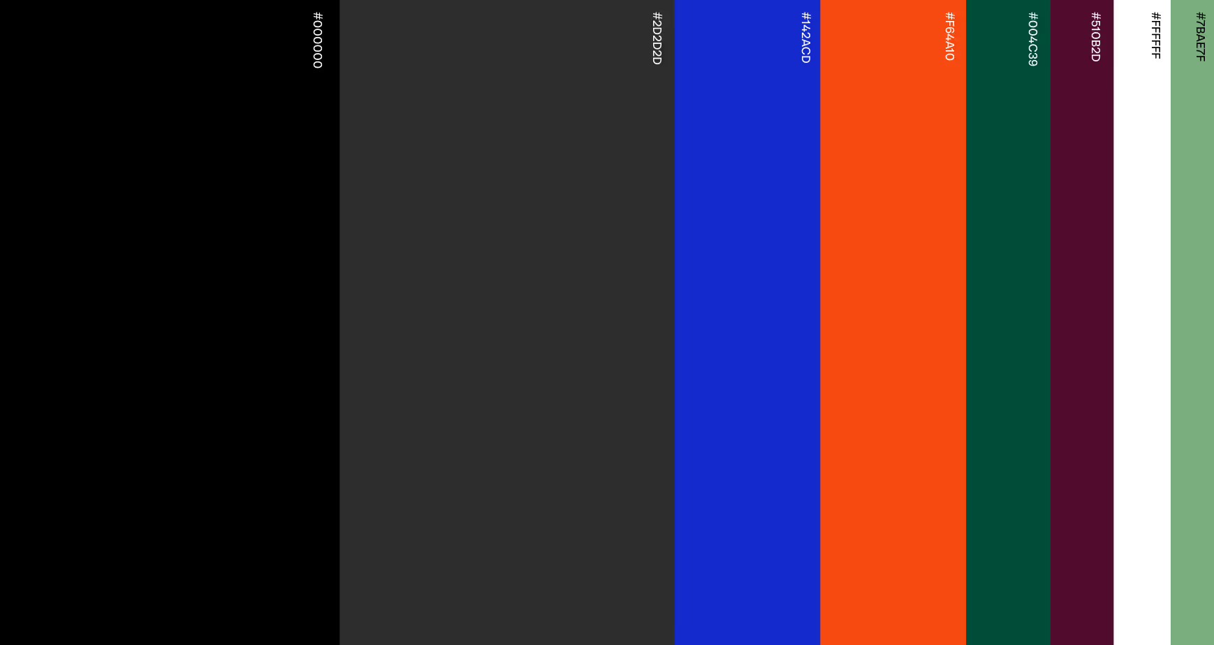
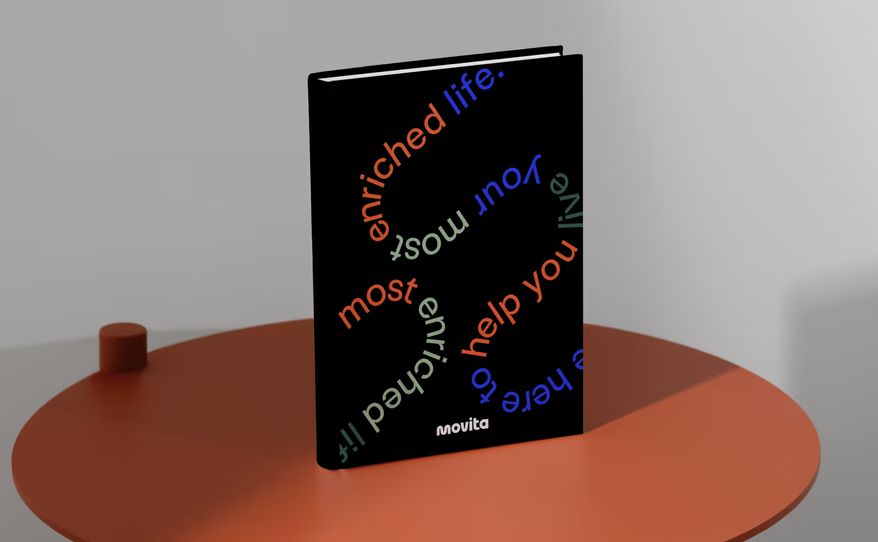
Movita walked out of the Sprint with a finished identity for a space that hadn't fully existed before: a full-family wellness brand that feels premium and warm at once.
The logo landed, the imagery problem was solved, and the loose, hard-to-name concept had a coherent visual world to live in.
A complete identity — logo, color, type system, signage and stationery framework, social direction, and the structural look and feel for the website — delivered in a 10-day Sprint for Good™. A foundation built to open one center and scale to the next.